Whether through oversight or intention, the Mesa County Health Department does not have a graph of cumulative cases of Covid-19 on its website, but such a graph can give a clear picture of how well or how poorly our county is doing in preventing spread of Corona virus, and show us where we are going under the current conditions. This chart provides that missing information.
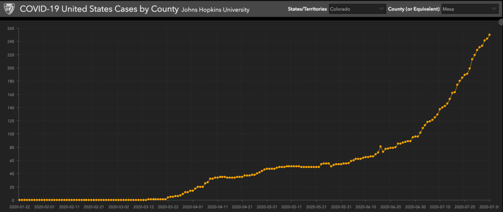
The locally-produced chart above is confirmed by Johns Hopkins University’s chart of Coronavirus cases in Mesa County, which looks starkly similar to the Kozak chart, although the Hopkins’ University chart starts on January 22 and goes through July 30, 2020:


Thanks for your work
The numbers are definitely going in the wrong direction. We should be flattening the curve…or how about trying to trend downward? Stupid is as stupid does….Thanks for putting this graph out there.
Probably can double that since it shows only tested cases. Still remarkable how many people walking around without masks. You can do an IQ test in a flash.
This county is bullied by Trump fanatacism or should I say facism.
Is Social Darwinism so bad?
A good friend, who has been visiting another friend in ICU, may have been exposed to COVID-19, FROM St. Mary’s. Healthcare workers are now quarantining, because it takes 2-7 days to get results. Contact tracing is a bad joke. They refuse to define their outbreak as an “outbreak” solely because they don’t know where it started. You need to know that an entire floor of the hospital is dedicated to nothing but covid, and Drs. and Nurses in this unit are contracting the virus, and infecting others. Kuhr and the MCDPHE have grossly mismanaged the Pandemic.